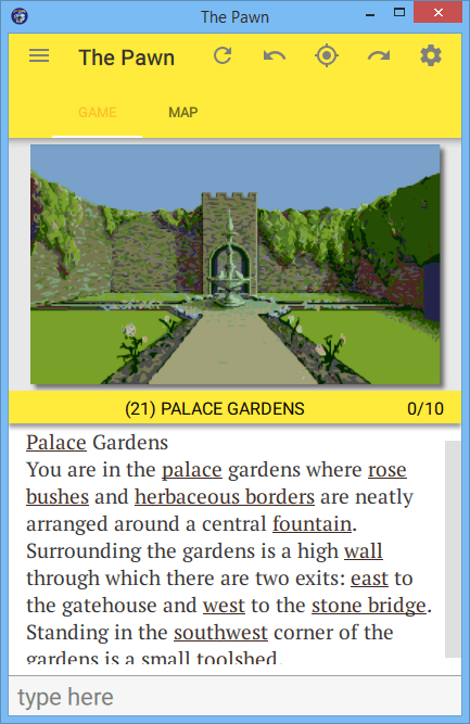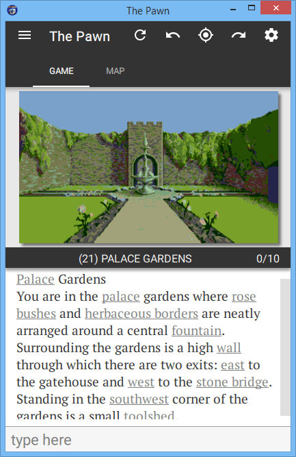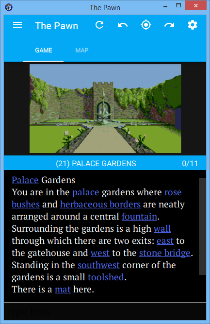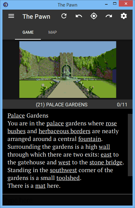
A while back we promised inverted colours; that's light text on a dark background, as opposed to the (now usual) dark text on a light background. Of course, the original games were all played in this light on dark mode, so it's pretty cool - even if you don't have a black iPhone to go with it.
Adding this feature to the Apps was delayed by the idea that it shouldn't just be a choice between dark vs light, but a whole palette of colour themes to select from that all support both a light and a dark mode;
And sure enough, that's what you've now got!
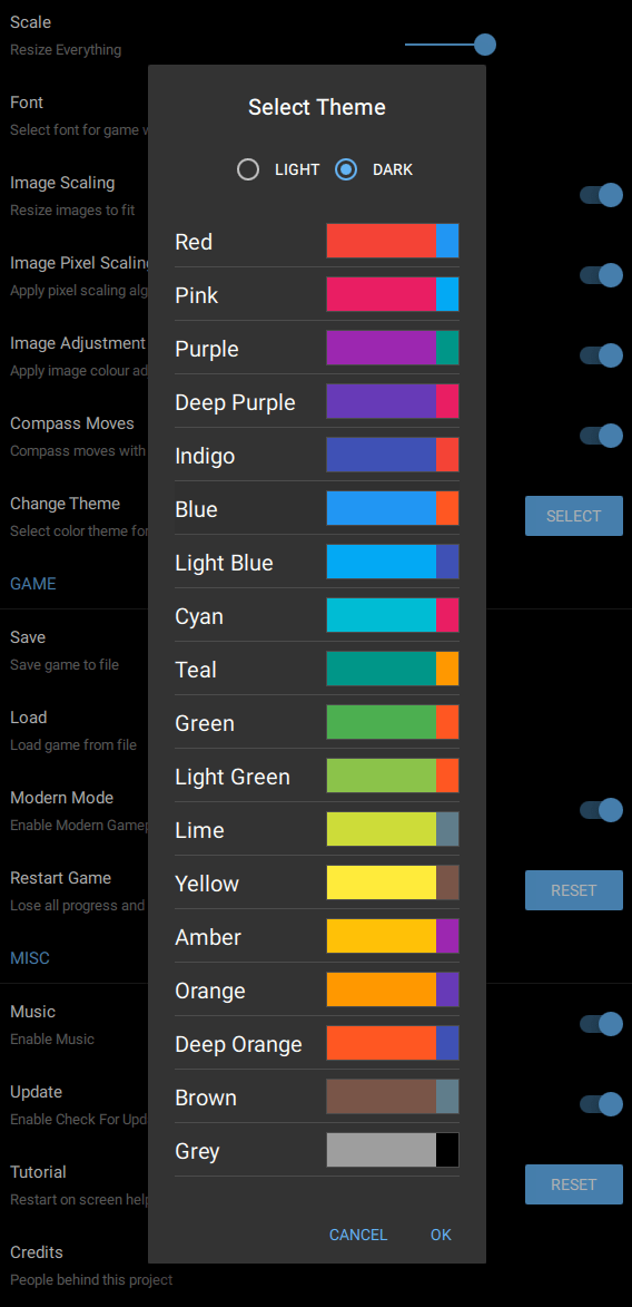
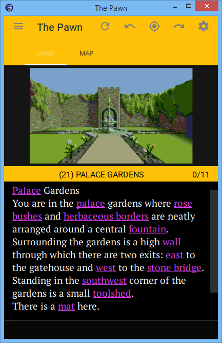
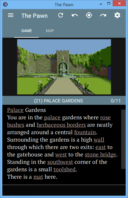
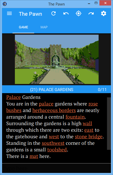
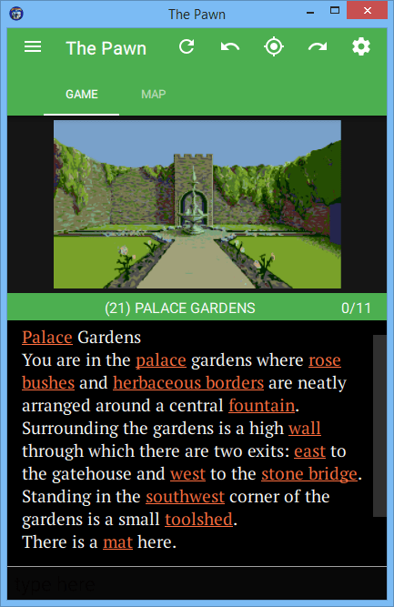
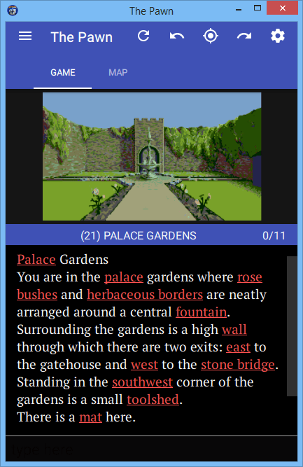
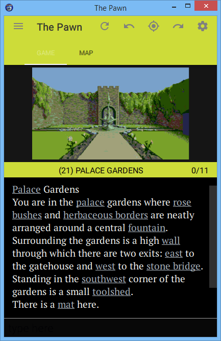
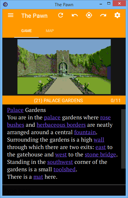
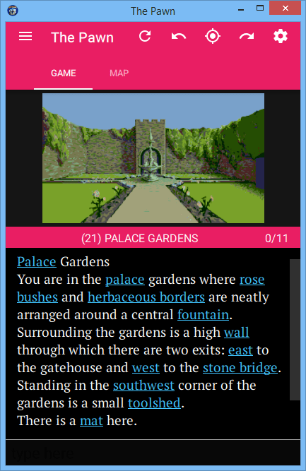
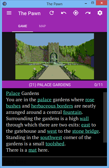
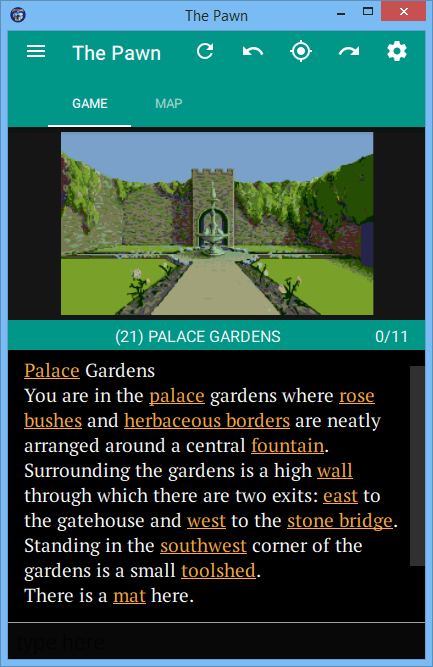
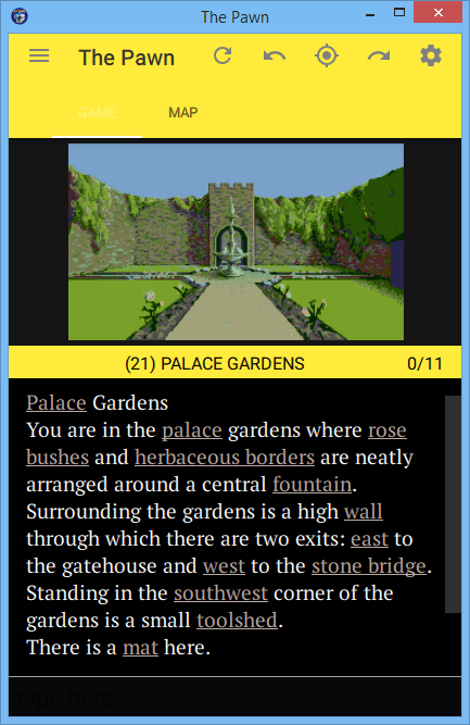
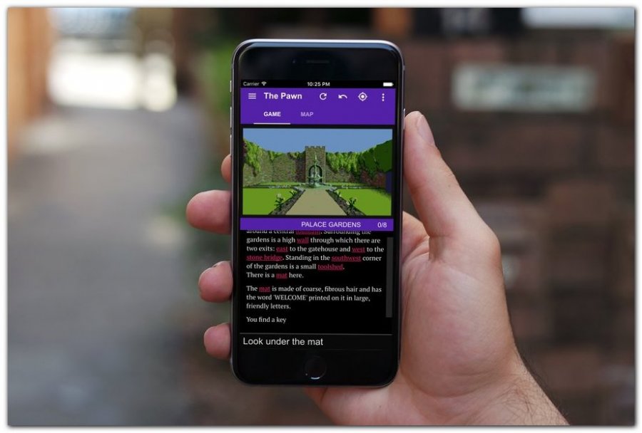
Each of the colour themes has a primary colour and a secondary contrasting colour, and all choices also come in light or dark - that's to say against a light background or a dark one.
The colours are all chosen from the Material Design spectrum. Each primary colour is matched with a corresponding contrasting colour from the same spectrum but darkened in shade.

Each color comes in a number of light to dark shades. Many of these shades are used in parts of the user interface, chosen automatically from the theme base primary color (signified by shade 500).
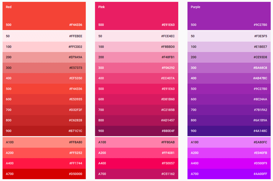
You can read more about the Material Design colour schemes here.
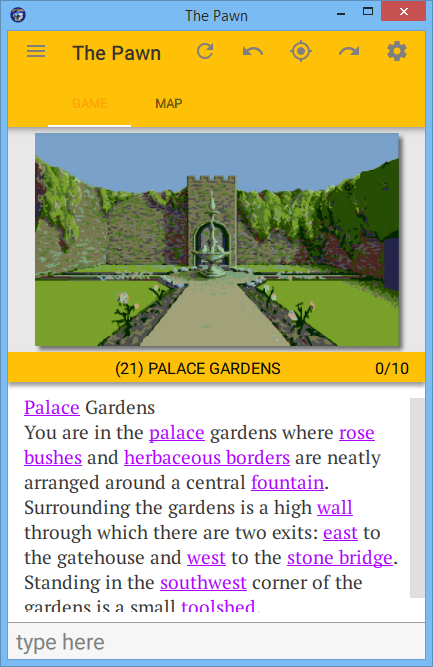
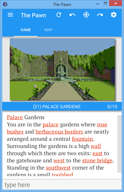
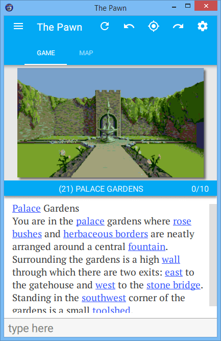
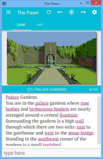
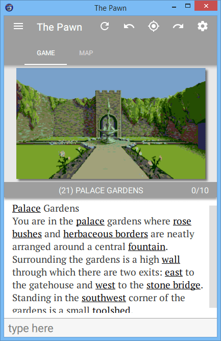
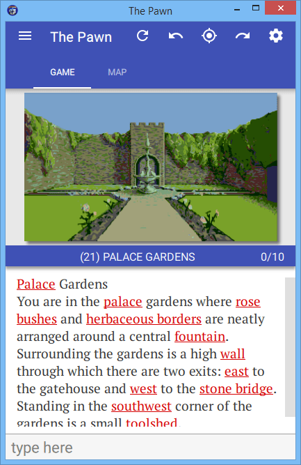
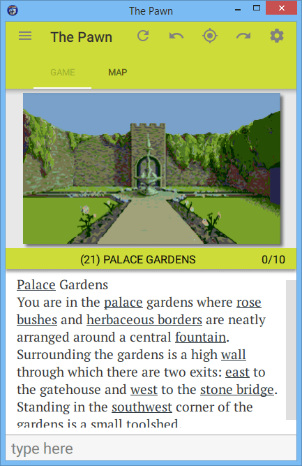
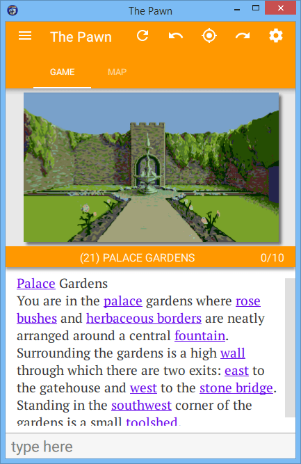
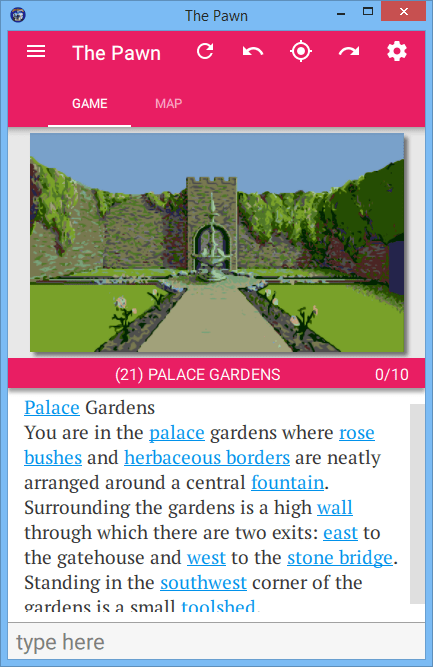
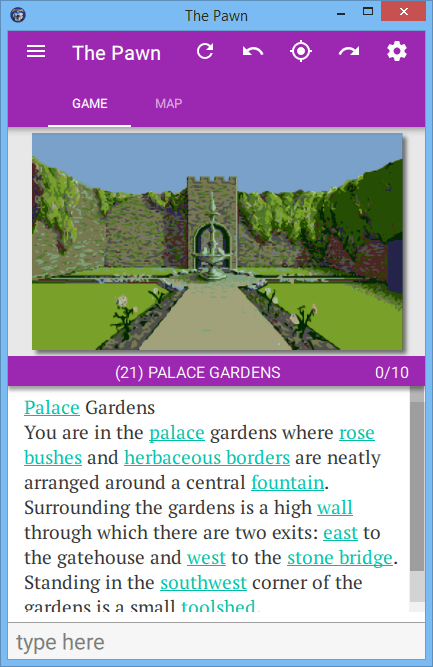
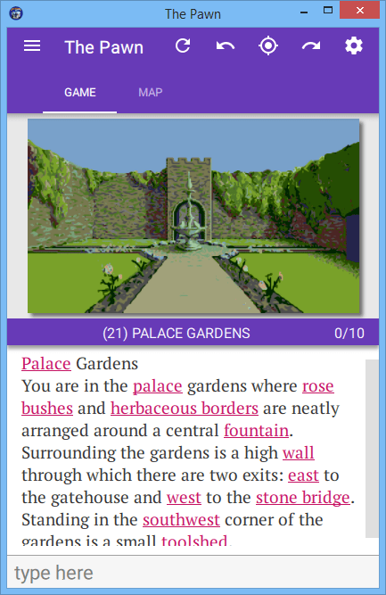
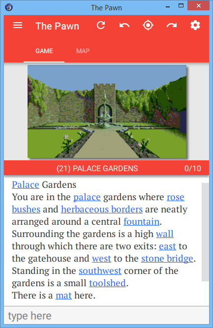
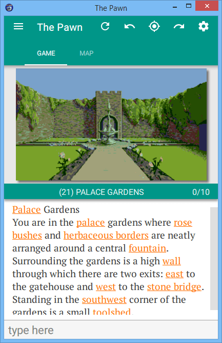
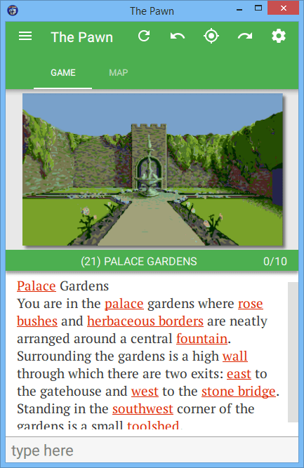
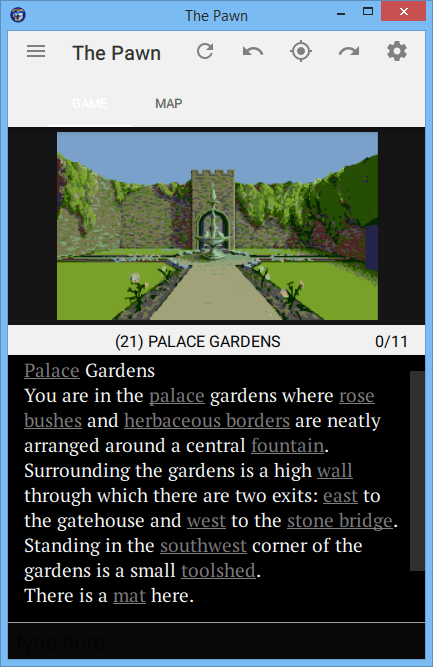
Here's what some of the themed screenshots look like;