New Theme Palette Selector in Pipeline
In response to popular demand, a new "theme picker" is in the pipeline.
WIP:

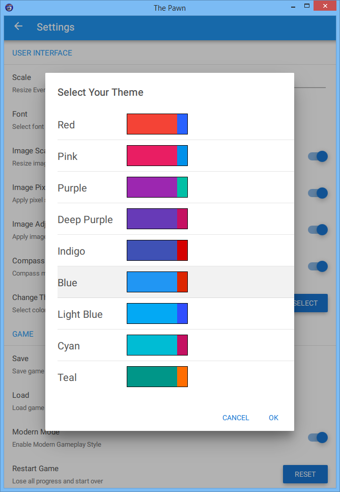
The theme consists of a main color and a contrasting color. At the moment, each theme to select consists of both colors. I chose these by experimenting with the material design color selector here.
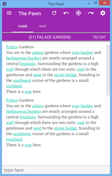
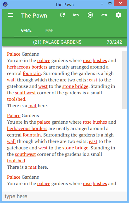
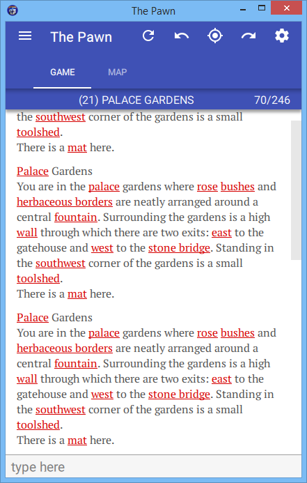
examples:


As a start, i've taken each of the main Material colors (see here and chosen a secondary color that, i hope, isn't too terrible.
Hope to get something out with this working in the next few days.
Comments
I'd like a theme with a black background in the output window
So far, these are "light" themes, where the background is white and the various bits are shaded.
I'm now looking at dark themes, where the background is darker than the controls and text. will post some results.
Dark themes WIP, you get the same set of color choices, but in a dark theme.
here are some examples;
Great! Molto bello! :-)
My eyes love the dark theme! Thank you!!!
I hope to put out an iOS version of this soon.
Also seems faster!
Awesome news! Performance of the picture loading should have improved. A few other tweaks here and there also - for example drop shadows aren't needed in dark mode. These take a surprising load on performance.
I'm currently working on assembling various bits of media needed to publish on the App Store. The next phase is to prepare this and make a formal Apple submission.
Thanks for all your testing efforts, they've really made a difference!
No problem! It was nice playing around and breaking things!
I'm enjoying playing the game!