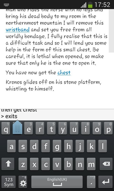
Android :: Keyboard arrow sometime obscure virtual keyboard when typing in commands
As per the following screenshot (on my S3 mini). It is a tad irritating.
Don't know what can be done. Suggestions?

As per the following screenshot (on my S3 mini). It is a tad irritating.
Don't know what can be done. Suggestions?

Comments
Yes, i've seen this too. it can depend on the keyboard type. It's actually a bug in Qt.
I found another bug. Or feature.
When the input area is maximized like this, the keyboard pops up when you tap in the input area.
However, when it is small (or is resized beyond a point), the keyboard does not pop up any more.
No amount of tap tap tapping (like the raven) will bring the keyboard up. Only way is to make it larger.
PS : posting from mobile, not sure if the attached pix is really that large or not. If so, please forgive! Will fixxit on Moanday
And that Qt arrow is also annoying. Nothing you guys can do about it either.
Interestingly, on a S4 mini with lineageos, the arrow is smaller. But the same issue wrt input area size remains.
By the way, I'm not complaining, just want to help getting rid of nasty bugs
aha! I've seen thiis bug where you can't tap when the text entry box is small. I thought it mighty be my phone/pad.
Thanks for reporting this. I'll have another look into it.
When saving the game with a dark theme, the save name which you type in, is dark grey and not easy to see what you're typing in. Here I'm typing in "Start".
Yes, i just noticed this problem too. The dialog boxes are shaded slightly lighter in dark mode - except save/load, looks like i missed that one.
Will make an update.
Also, i'll have look into this "drop arrow" thing, there might be a fix or workaround.
> Also, i'll have look into this "drop arrow" thing, there might be a fix or workaround.
Shall I try different virtual keyboards?
ok, i've fixed the shades in the save/load dialog. now i look into the drop arrow thing.
BTW, i figured out the reason why you can't tap on the input box when it's small is because the tap is going to the "drag thumb" and not into the box. not sure what to do about this.
2. Make the box a static "one size fits all" thing?
3. Something else that we haven't thought about. A floating input window, perhaps?
I've adjusted the min size. Thanks for this. there was already a min size, but of course it's no good if it lets you make the box too small to tap on.
I think that's the short term answer anyhow,